Happenin'
"How can we encourage participation in local events while minimizing choice overload?"
Timeline
6 weeks
Tools
Axure, Illustrator
Role
UX Designer, UX Researcher
w/ Jamelia Shealey, Hannah Blum, & Matt McConnell
"How can we encourage participation in local events while minimizing choice overload?"
6 weeks
Axure, Illustrator
UX Designer, UX Researcher
w/ Jamelia Shealey, Hannah Blum, & Matt McConnell
Finding new things to do can be incredibly difficult. Searching for activities in your city might yield a long list of attractions that don't interest you - or you might just feel overwhelmed by the sheer number of options!
That's where Happenin' comes in. The app creates a more curated event-finding experience - one that minimizes choice overload and maximizes time spent exploring your community!
Event-finding apps aren't groundbreaking. We knew right away that we needed to understand similar apps on the market to figure out what they're doing well - and more importantly, what they could be doing better.
The Nudge is a small (~20 employees) company founded in 2018 that builds itineraries for urban life. They describe their target demographic as "active millennial women" and reach out to users via "nudge" (text message blast) to inform them of events.
Eventbrite is a large (501-1,000 employees) company founded in 2006 that allows users to create, attend, and buy and sell tickets to events. Their demographic varies widely in age and gender, but in contrast to Meetup, they are more popular in the United States than in other countries.
Meetup is a mid-sized (101-250 employees) company founded in 2002, similar to Eventbrite in allowing users to create and attend events. Meetup is less focused on selling tickets and more focused on fostering friendships through casual "meetups" between community members.
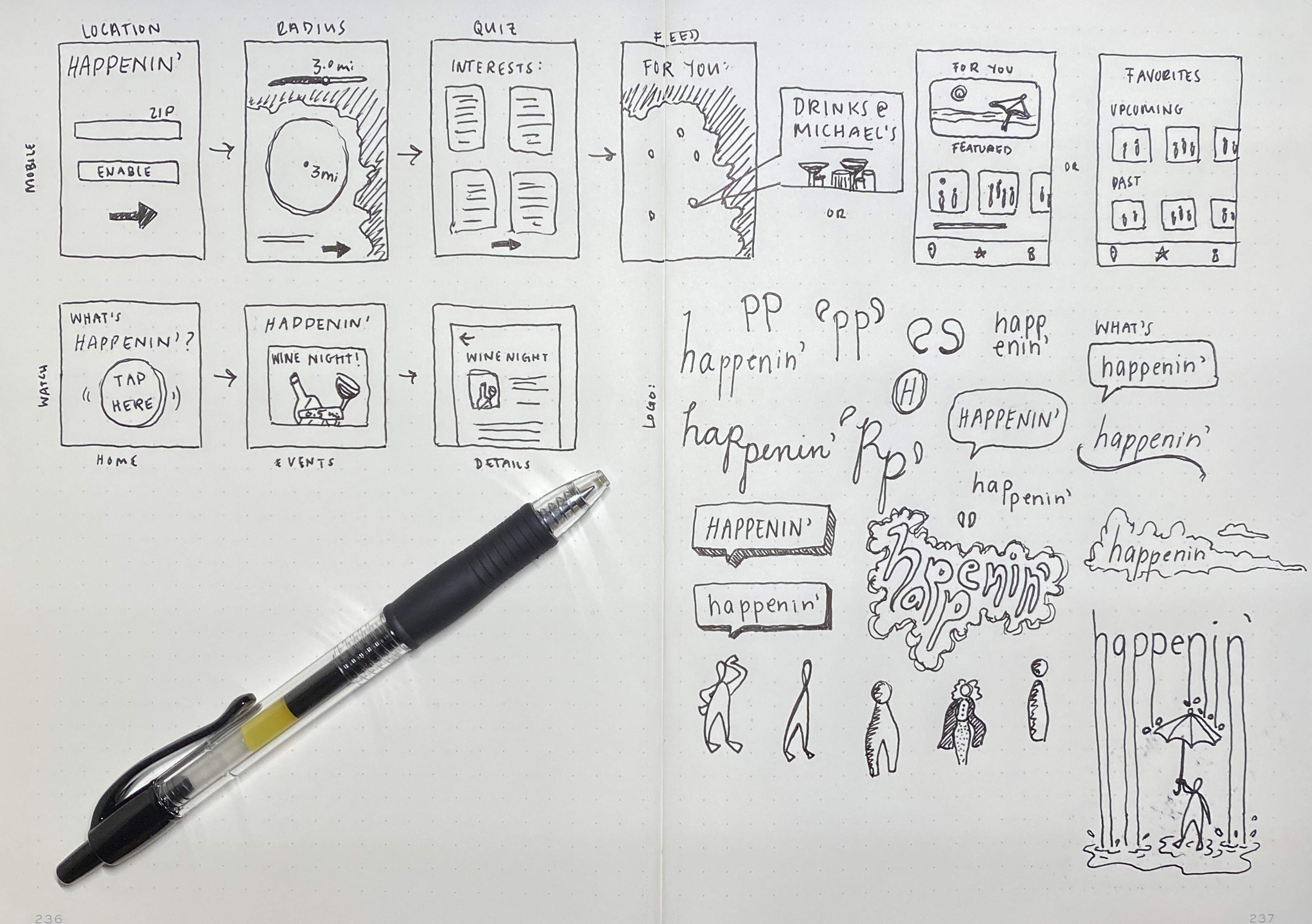
With a rough idea of the direction we were heading, we began to play with mobile and Smartwatch layouts. We were intent on making Happenin' a largely mobile experience - a quick and easy way to add excitement to your day, no matter your location.
It was important to think of the mobile and watch interfaces as an interconnected system. Which interface is best suited for which features? How can Happenin' play to the strengths of these different interfaces?
Based off of our competitive analysis, we found a majority of users would likely be young to middle-aged adult women. With this in mind, we created a couple of personas to reference through the process:

Age: 24
Occupation: Grad Student
Field: Computer Science
Goals
Pain Points

Age: 32
Occupation: Night Nurse
Field: Healthcare
Goals
Pain Points
Using our persona goals and pain points as a launch board, we established a list of important features:
Interest Quiz
To cater event suggestions to user interests
Watch & Phone Notifications
To notify users when they are near events
Simple Interface
To avoid overwhelming users with information
Map & List* View
To allow users to browse events in multiple ways
*List View would later become "Swipe View" to minimize decision fatigue...more on this later!
Next, we iterated layout ideas through sketching.
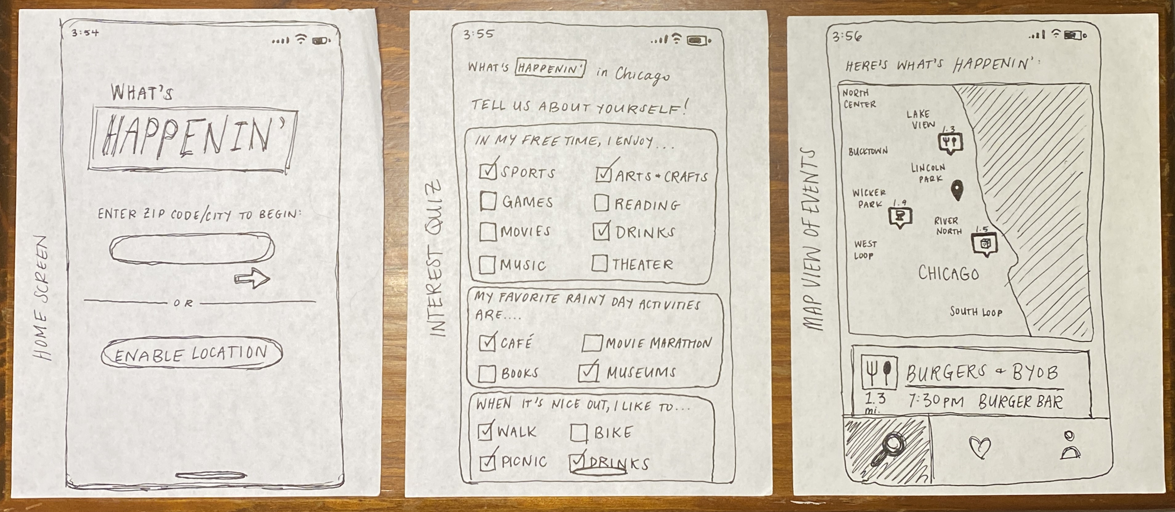
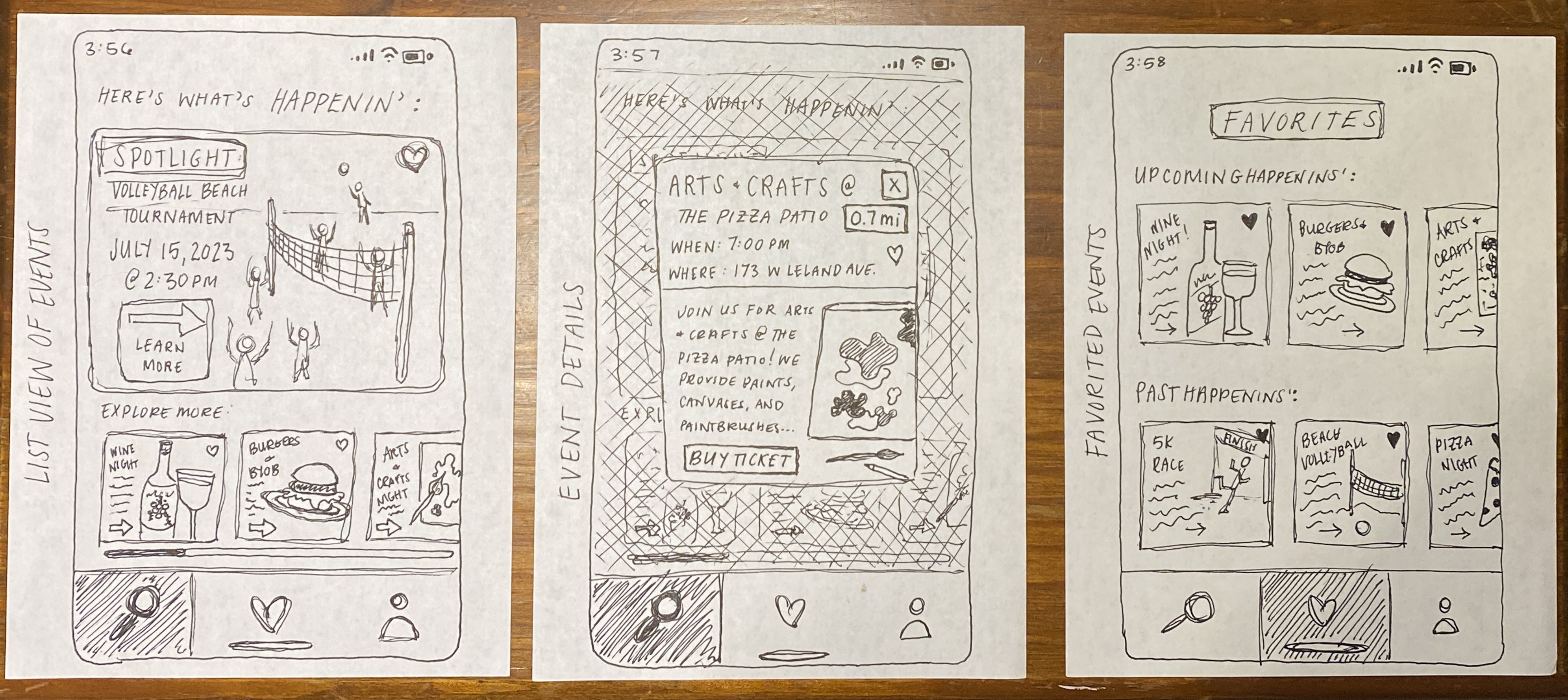
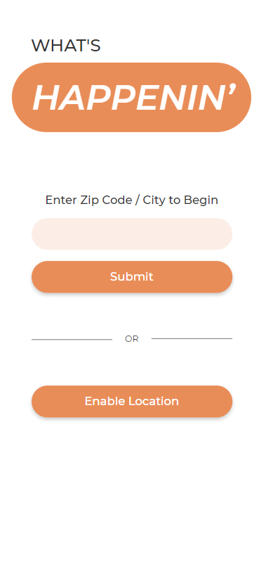
Splash Page
Users have the option to enable location tracking to receive notifications when they are near an event.
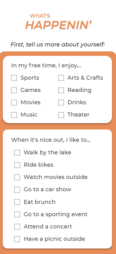
Interest Quiz
The interest quiz helps personalize each user's list of event options, eliminating uninteresting choices.
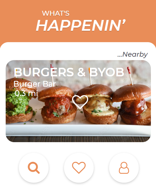
One thing that still bothered us while we developed the mid-fi prototypes was the "list view" feature. It didn't do nearly enough to eliminate decision fatigue, which was a pain point we felt compelled to focus on.
To combat this, we drew inspiration from dating apps to develop Happenin's coolest feature - "swipe view"! We kept map view as an option, as well, to make it easy for users to find nearby events at a glance.
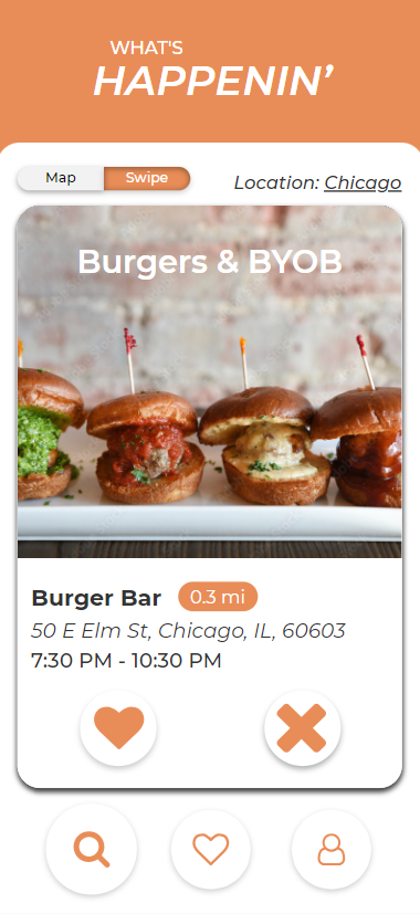
Swipe View
Happenin' shows users one event at a time - if they are interested, they swipe left!
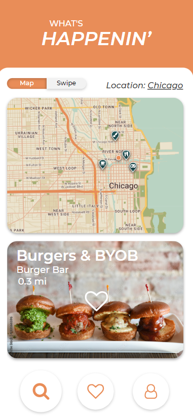
Map View
Important for ease of use, users can also check out nearby events on a map.
On the watch interface, we removed the map feature but kept the ability to see nearby events.
An added feature for Smartwatch, when GPS tracking is enabled, is the ability to receive live notifications when you walk near an event. This is designed for users that want to be a bit more spontaneous while they're out and about!
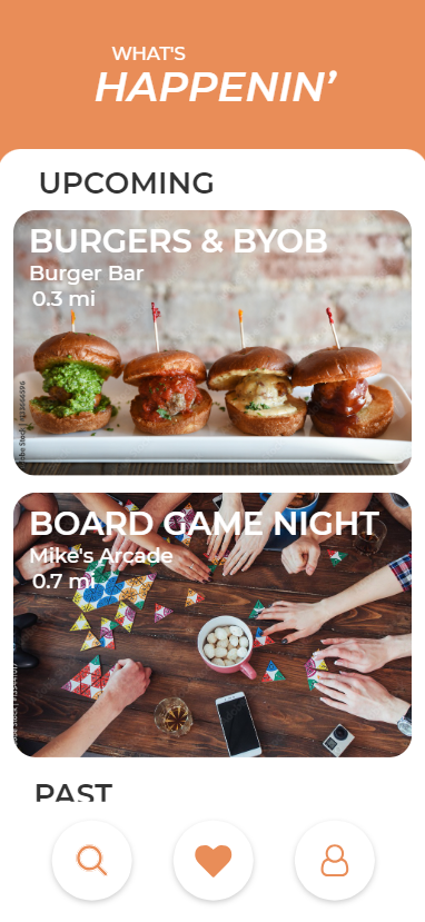
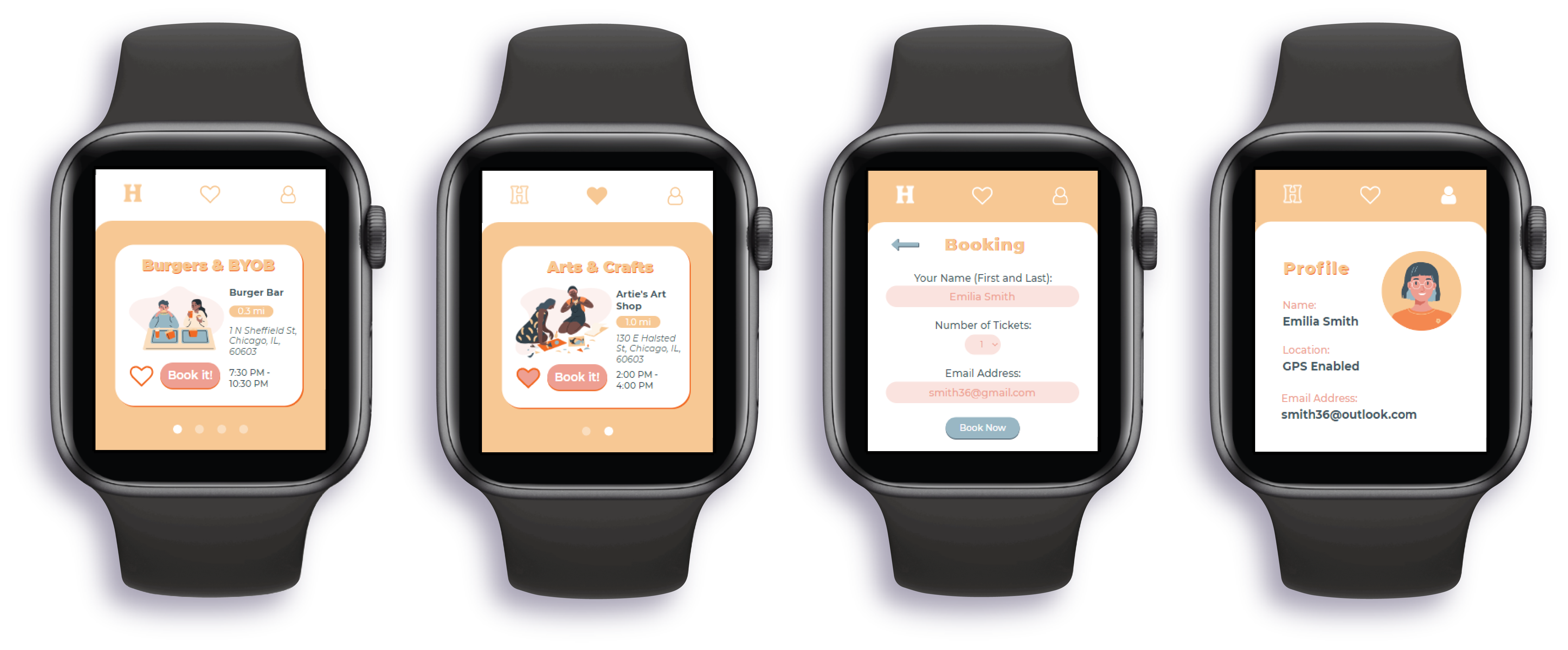
Nearby Events
Smartwatch interface shows a simplified version of nearby events, with the ability to favorite and view more details on mobile.
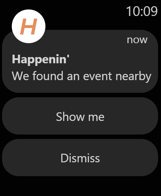
Live Notifications
With location enabled, users receive live notifications when they approach an event near them.
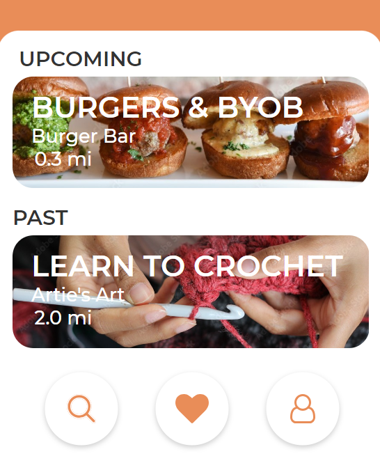
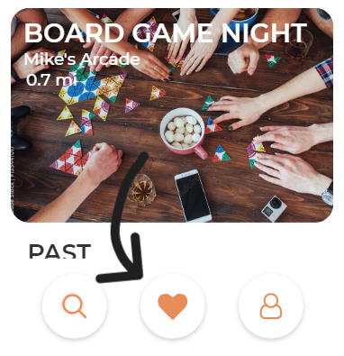
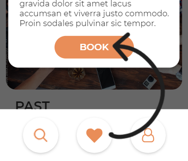
Users also have the option to "favorite" events to view later. From the Favorites tab, users can see event details and book reservations.
Favorites Tab
Users can access favorited events through the favorites tab.
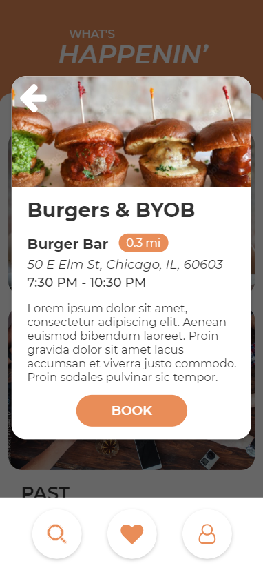
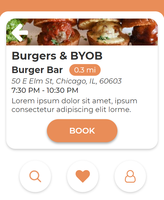
Event Details
Users can access event details and book events by clicking on event banners.
To ensure consistency between user tests, we created a scenario-based test plan with the goal of answering the following categories of questions:
Navigation
Can users find everything quickly and easily?
Event Booking
Could users book events without any issues?
Pain Points
Was the interface overwhelming to users? Were they satisfied with their experience?
General Interest
Did the app interest users? Were there any features they liked/disliked?
In general, users were able to complete the tasks with little to no issues. We did, however, have some navigational and layout changes to implement to create a less confusing, more streamlined experience.
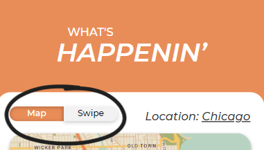
Swipe View > Map View
Users overwhelmingly preferred Swipe View to Map View and were disappointed the app opened on Map View.
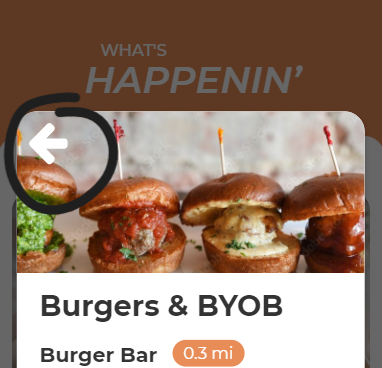
Hidden Back Buttons
The back buttons throughout the site were hard to find - users often saw no way to return to previous screens.

Small Watch Interface
Users found typing too difficult on the watch interface due to its' size.
Event Details Access
Access to event details was inconsistent between mobile and watch interfaces. On mobile, details were found in the Favorites tab. On watch, details were found in the List View.
Unclear Booking
Users were unable to book events unless they were "favorited" first.
In addition to implementing the major structural changes that came up in testing, we replaced the photography with colorful vector characters and softened the color palette.
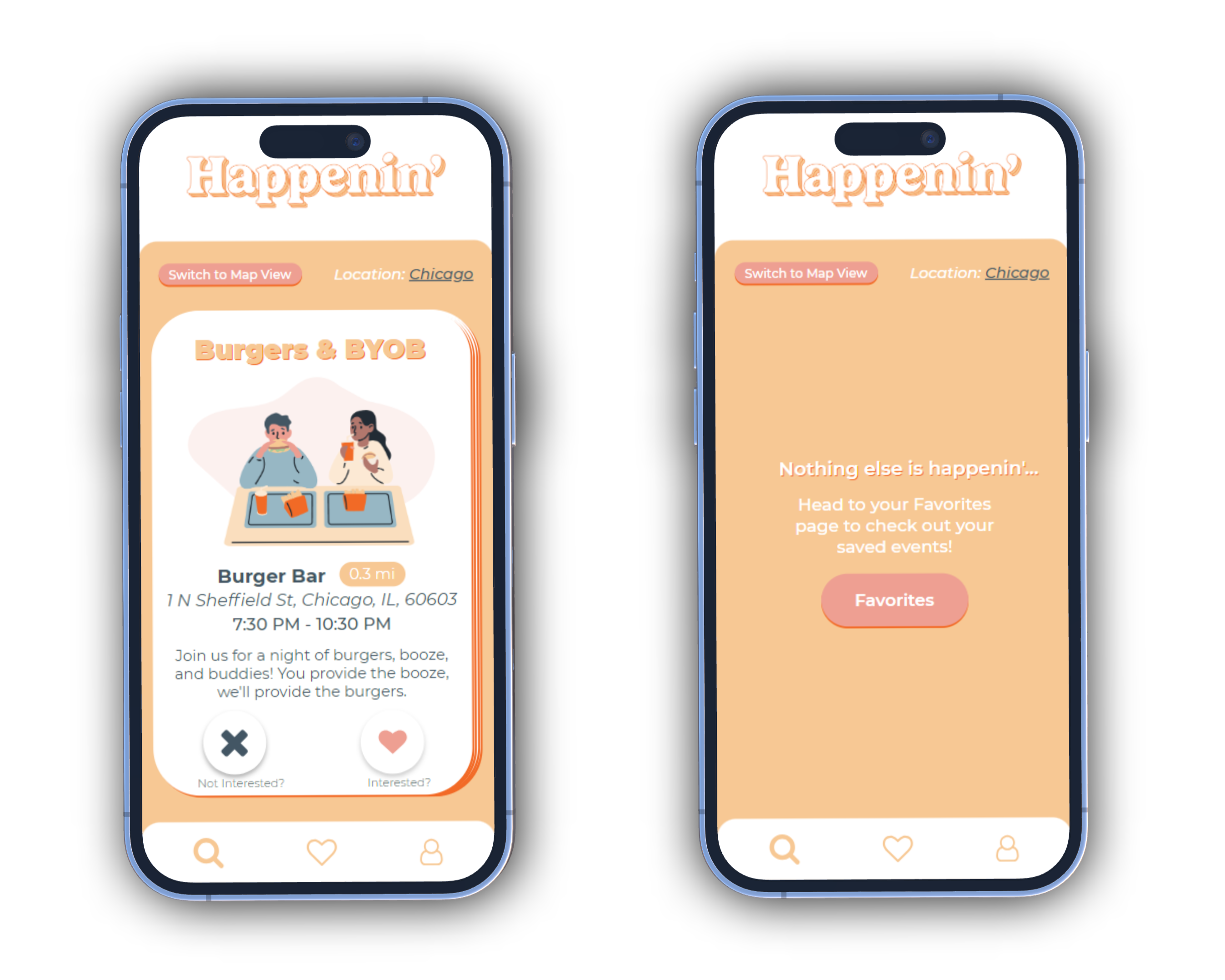
Swipe View
Incorporating feedback from testing, users are taken directly to "swipe view," where they can browse events specific to their interests. "Liked" events are saved in the Favorites tab.
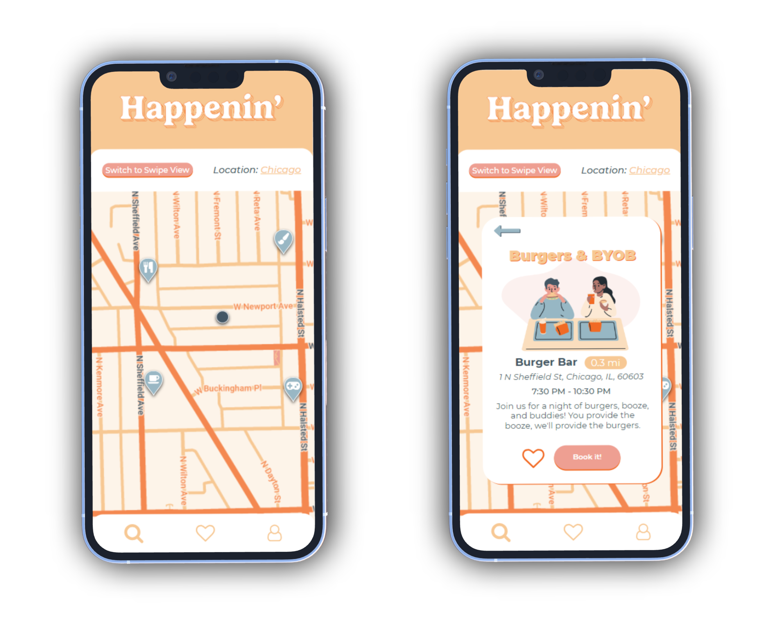
Map View
Users also have the option to see which events are close by with "map view". Based on user feedback, we added the option to book directly from the map view "details" screen.
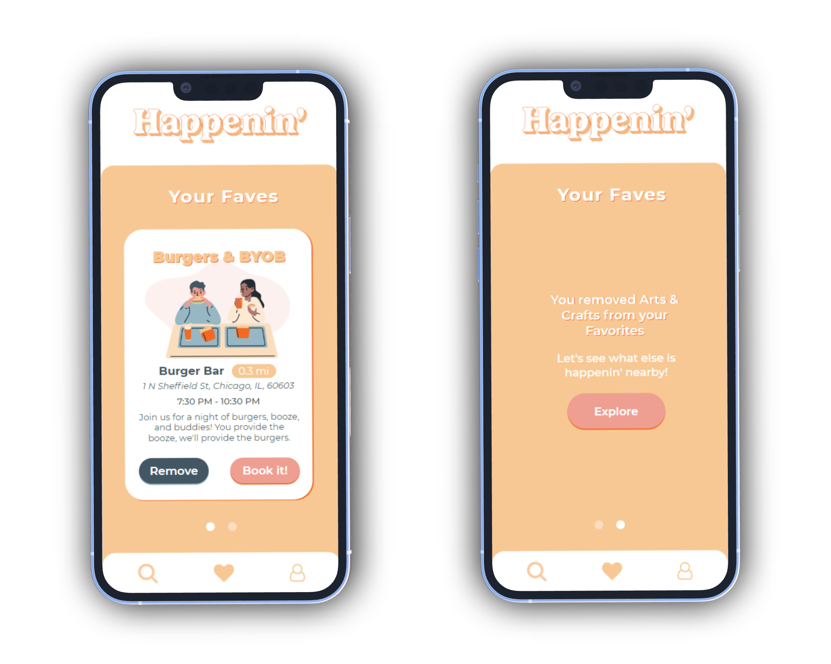
Favorites
Users can visit the Favorites tab to view, book, and remove events. If an event is removed, users are prompted to return to the Explore page to discover more events.
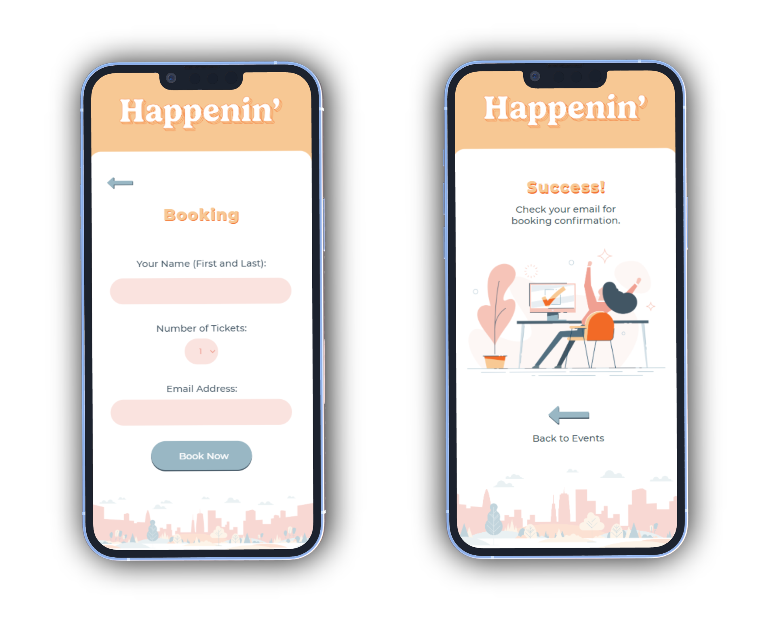
Booking
Booking is easy. Users enter name, number of tickets, and their email address (if not saved). Booking details are sent to the user's email.
The watch interface works in conjunction with the app. Users do not have access to "map view" but can still access "swipe view" and their favorites.
Testers mentioned they hated how small the keyboard was, so the watch app autofills user profile information for booking.
This was the first project in grad school where I thought to myself, "man, this is something I can put in my portfolio!"
One of my major issues with Happenin' was the lack of iteration that was, well, happenin' at the beginning of the project. With deadlines looming, we didn't give ourselves the freedom to break out of the box and innovate, so the idea fell a bit flat.
The most important thing missing from this project, however, is preliminary user research to understand how users use existing event apps. Since the main focus was building prototypes, we glossed over this step, which led to a lot of speculation on persona pain points and goals.
Overall, I'm happy with where Happenin' ended up, and excited to work towards better user research in the future!